Gallery of Contemporary Art in Brno
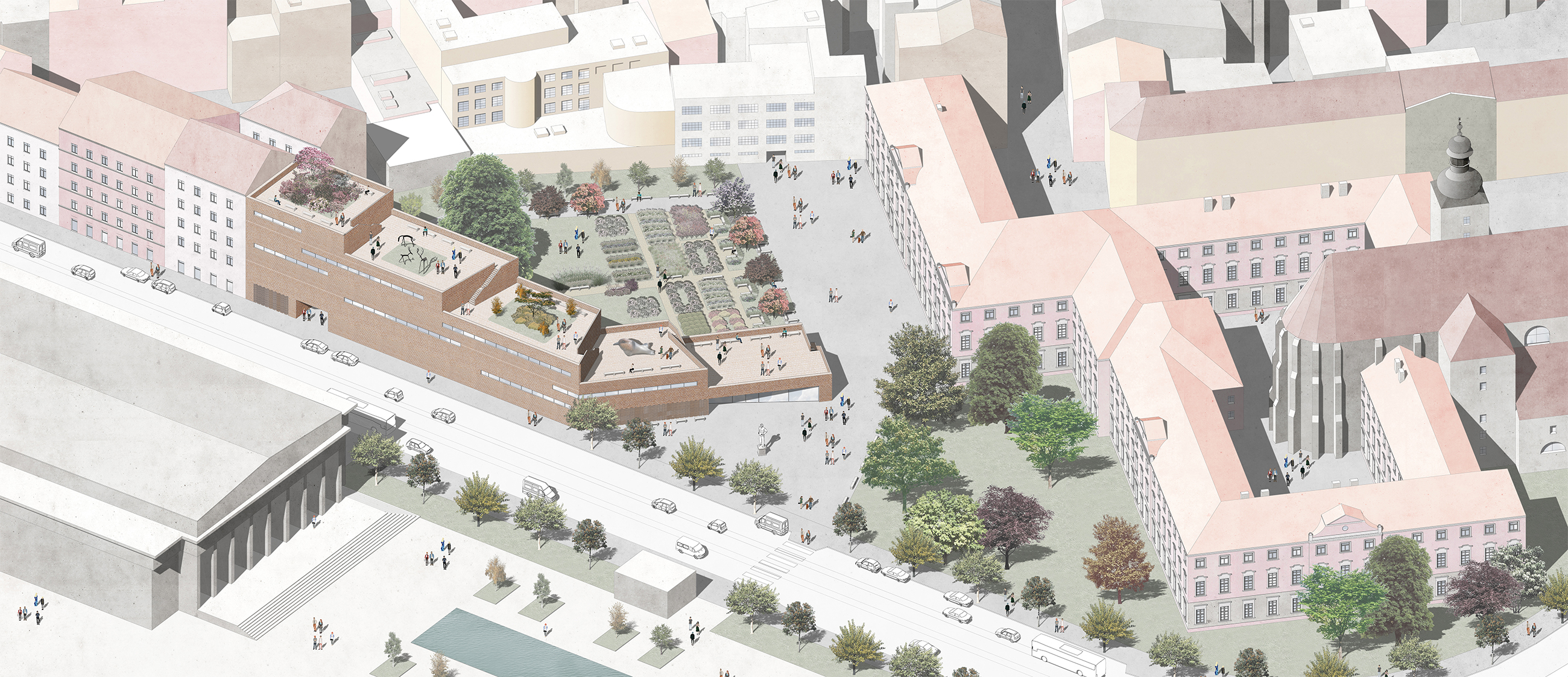
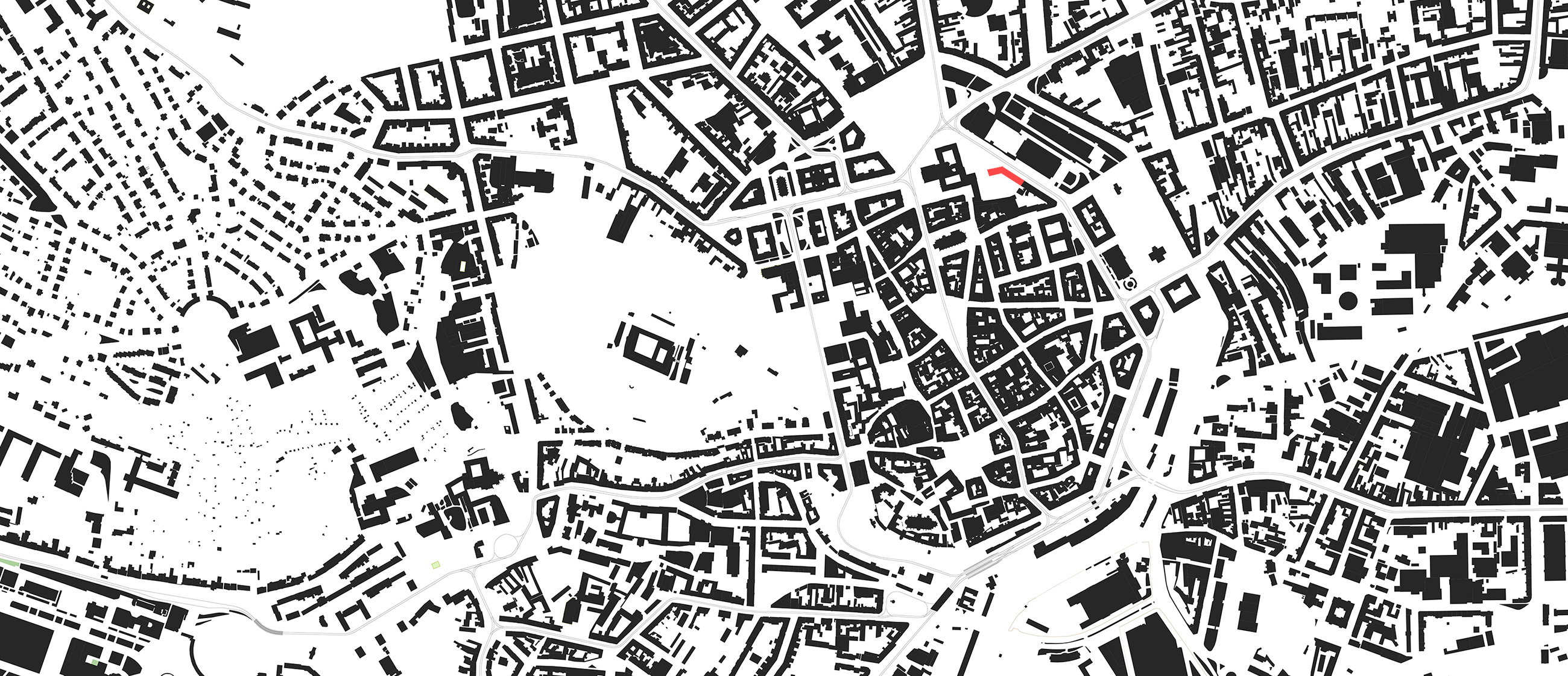
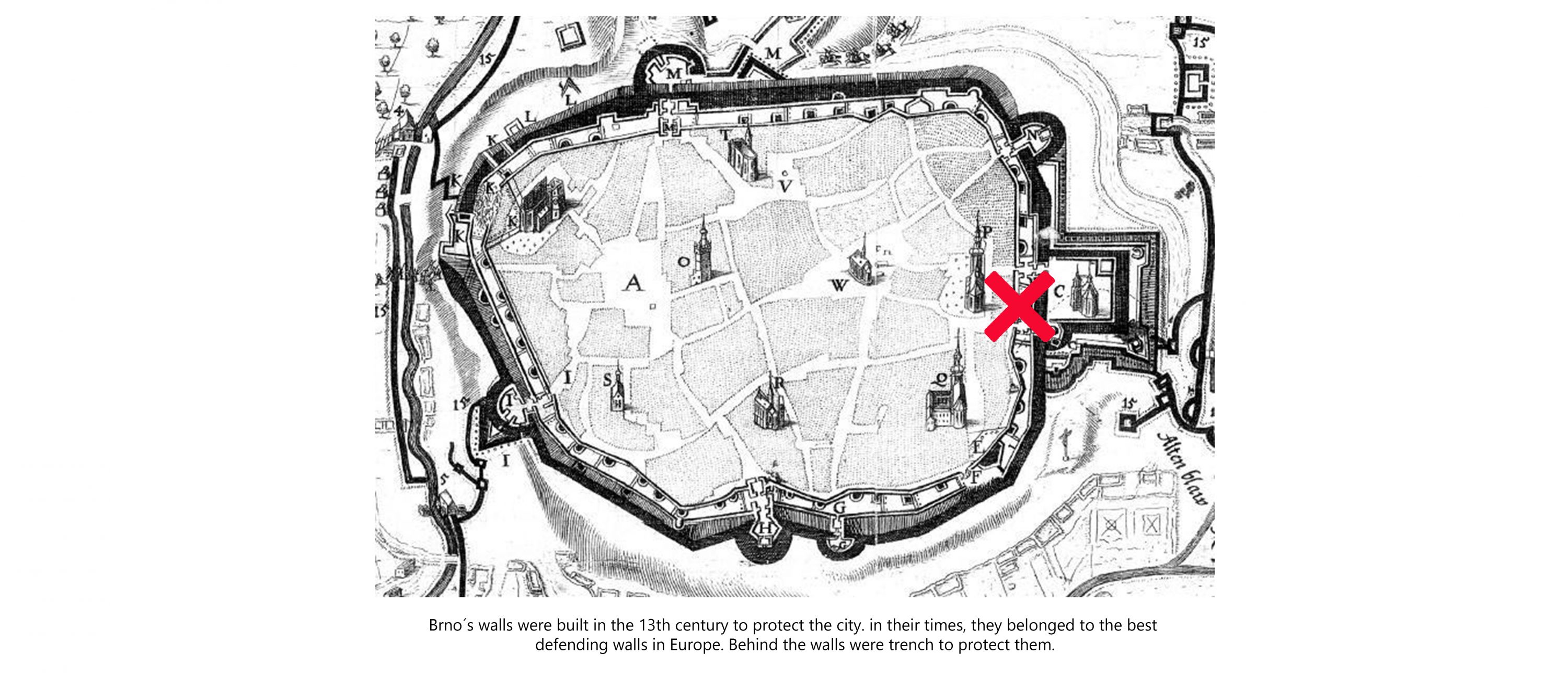
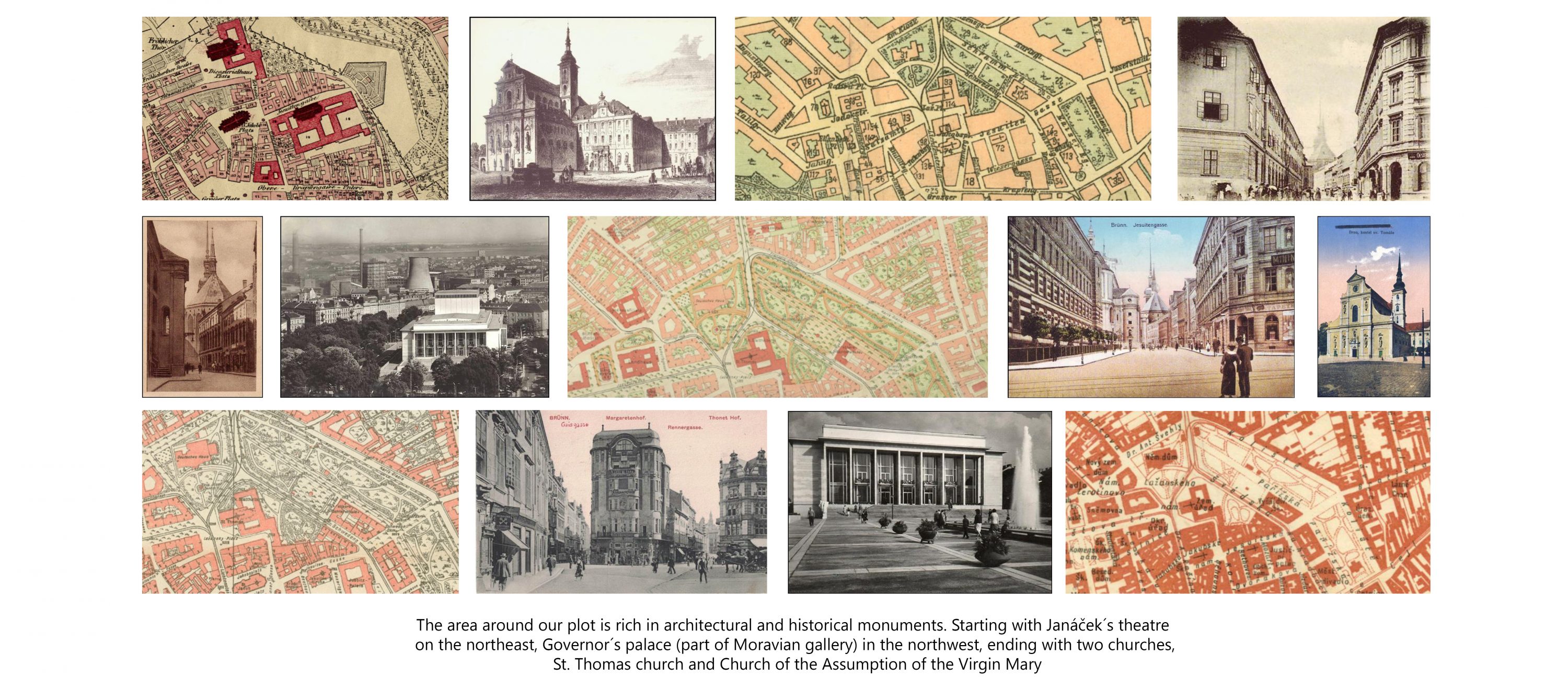
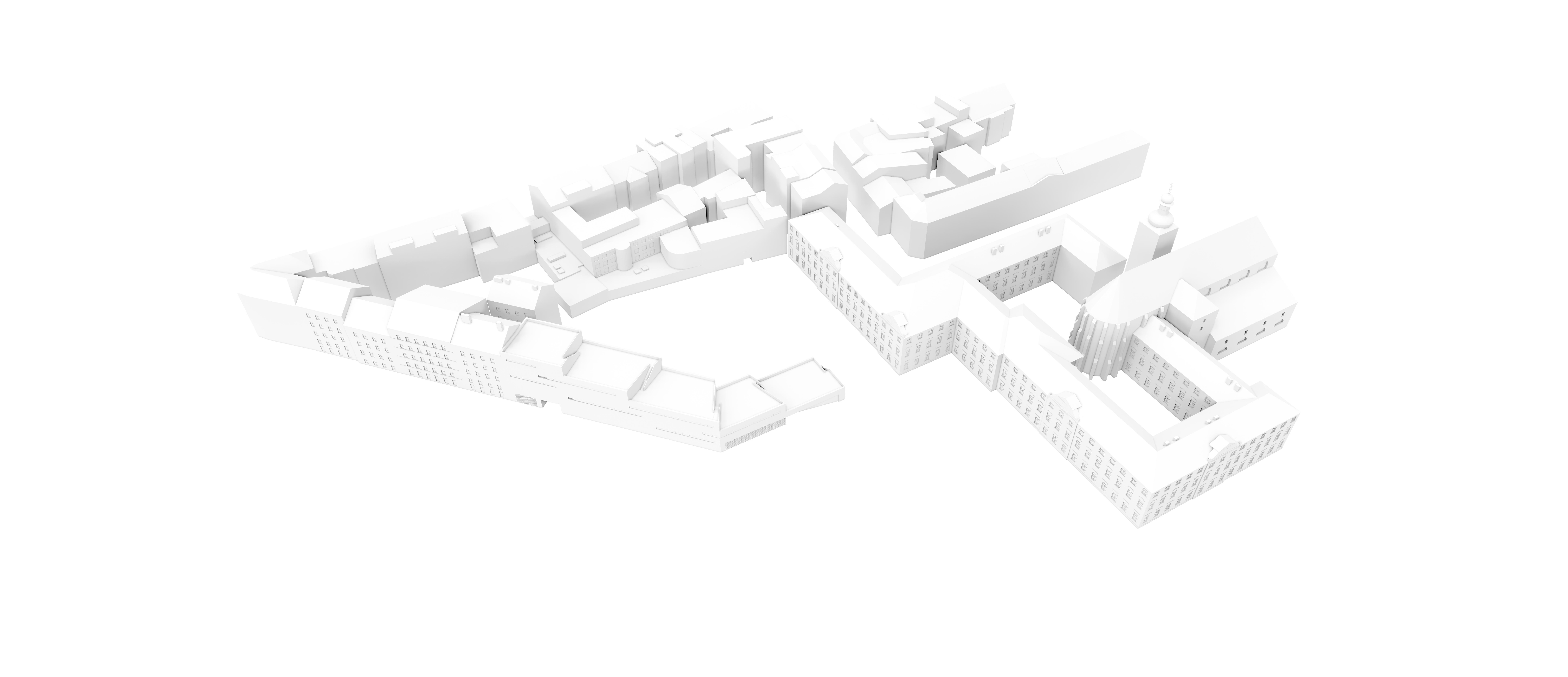
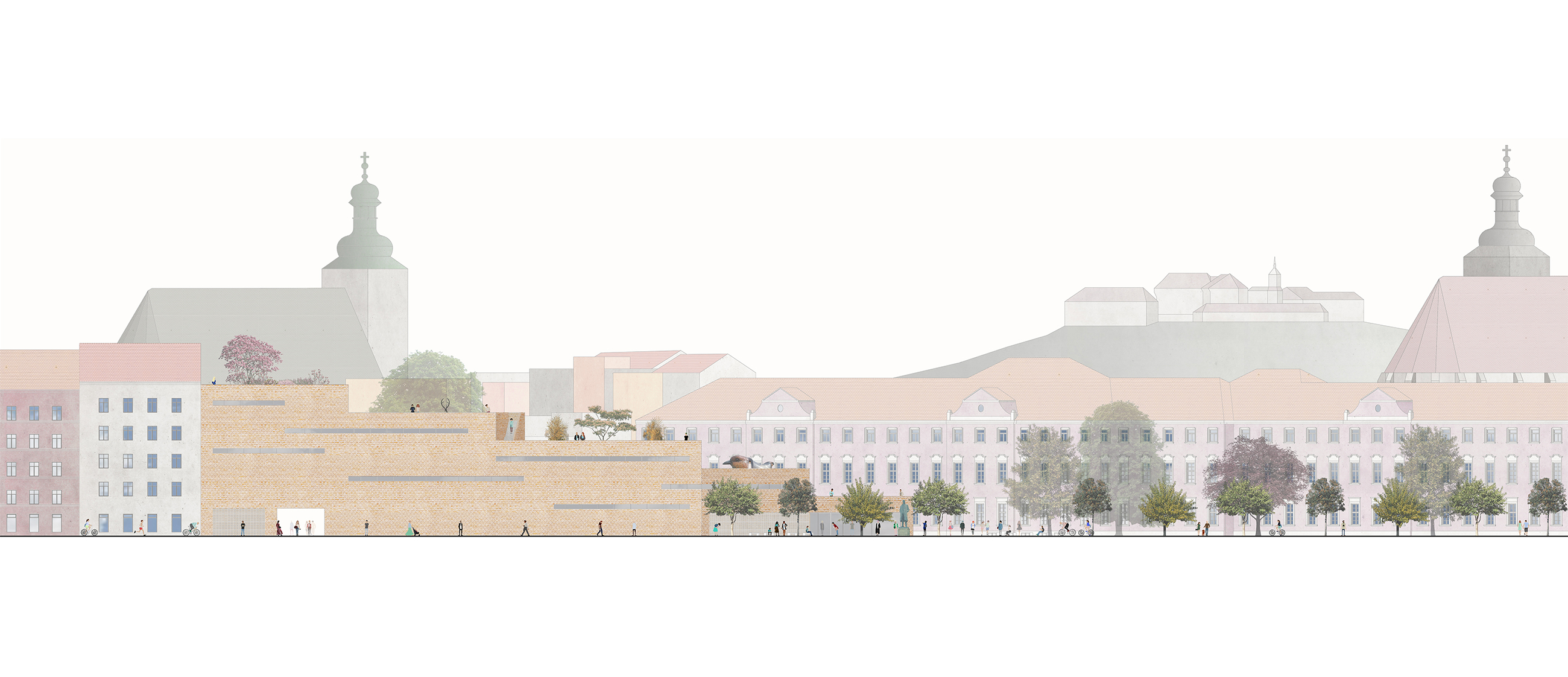
We wanted to create a building, which completes urban block and also provides another layer of public space. Our inspiration was former city walls, which lied on our plot. we can see some relics of walls in the city, for example near the castle Špilberk. These relics walls provide green public spaces. It´s a favorite place for meeting and it provides a great view.
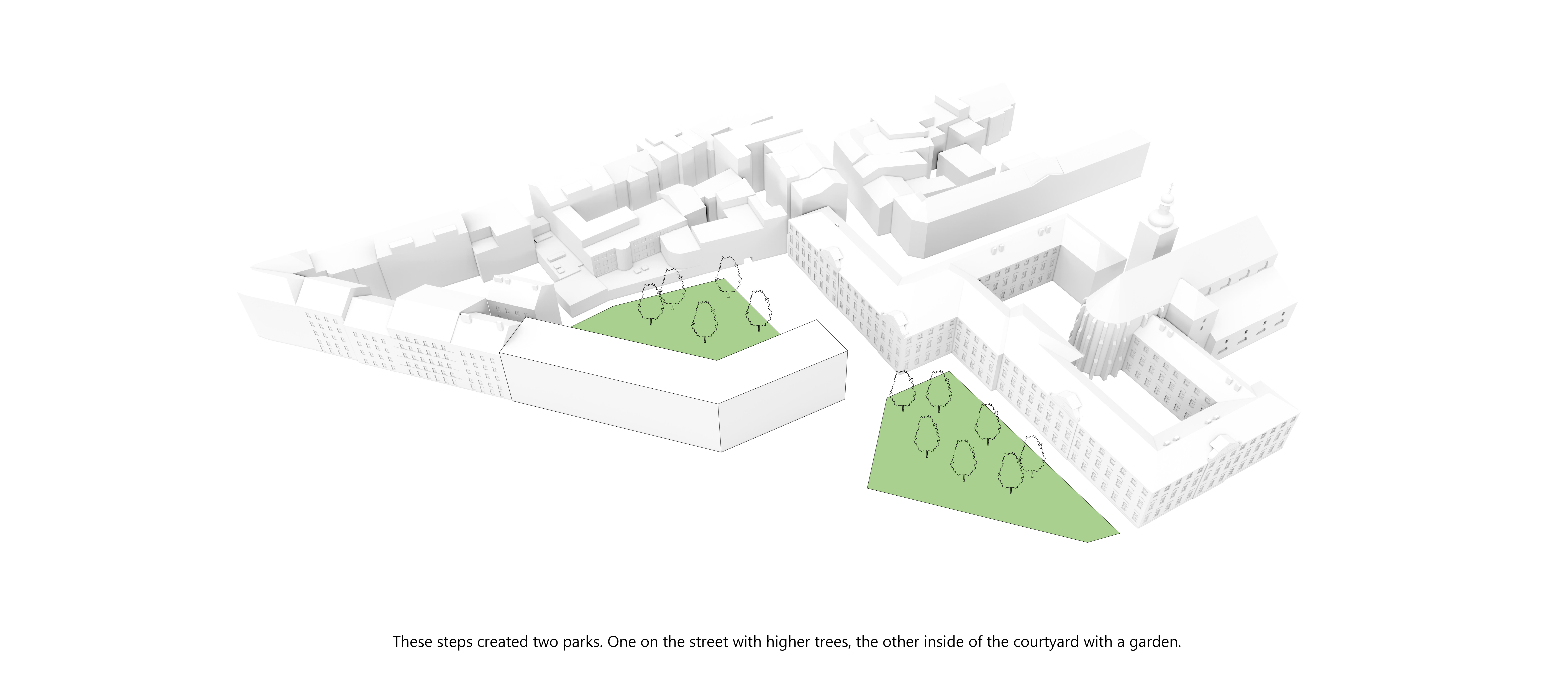
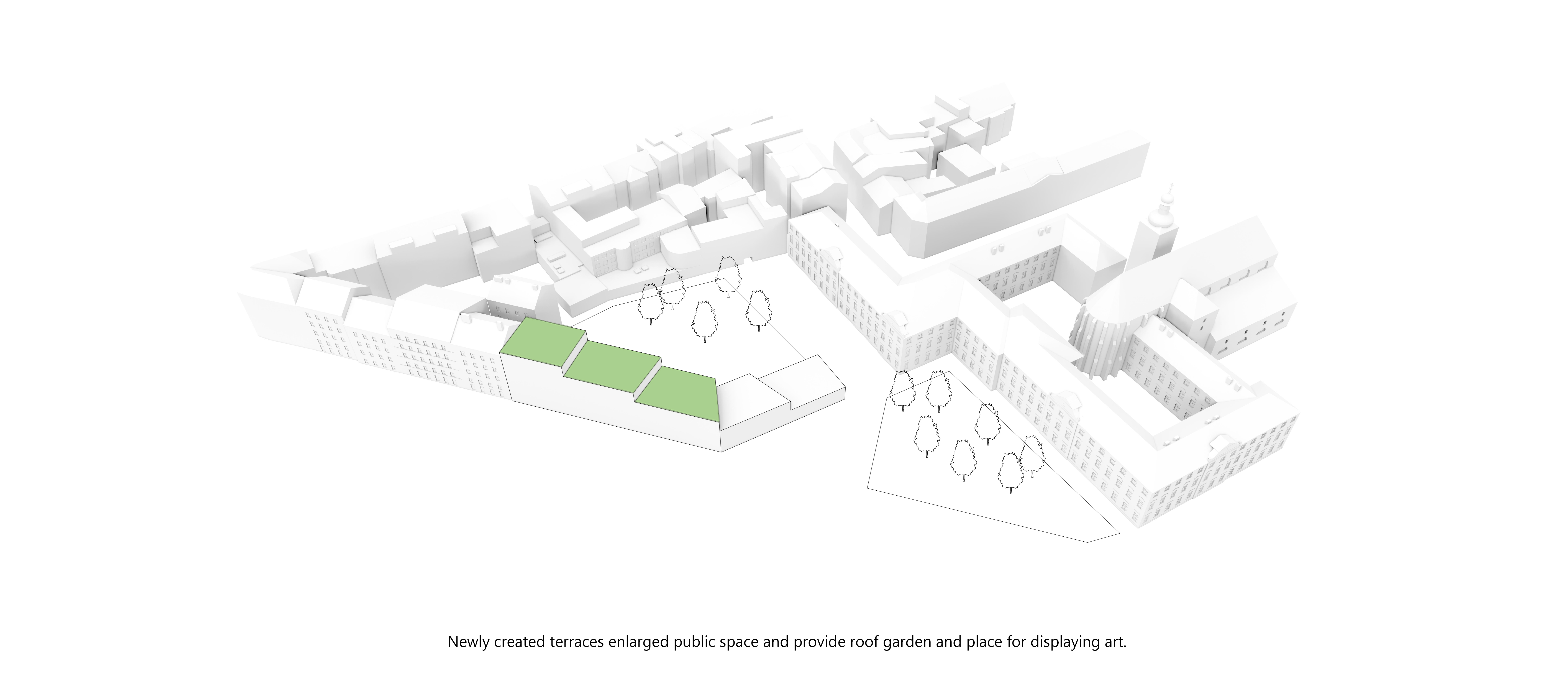
With our building, we split the present park into two places. First creates the front space of the gallery and we preserved present plants on it. Inside the new urban block, we designed a new garden, which is inspired by old monastery gardens, which we can find in old town centers. This garden provides a relaxing hidden place.
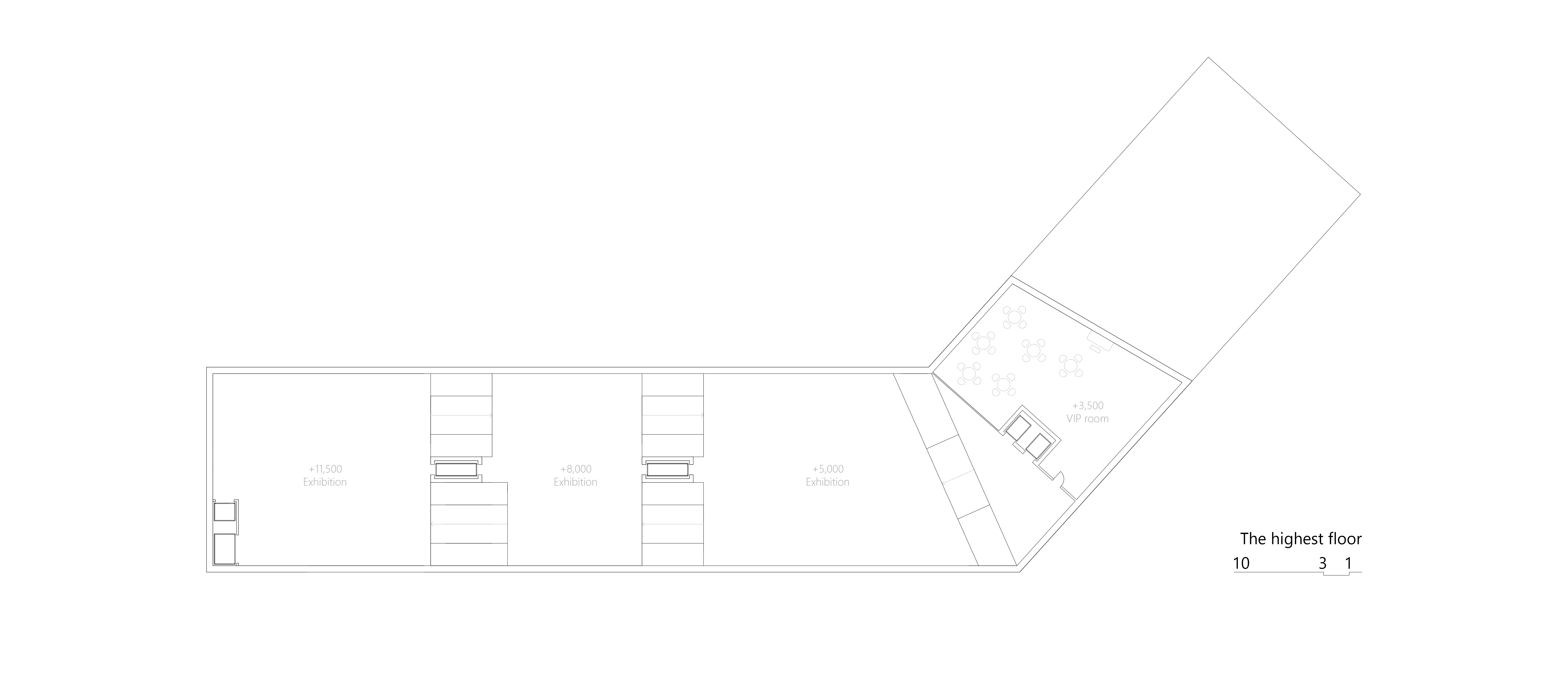
The roof of the building is available for all people. It is part of the urban public space. We didn´t take any area or urban place with this solution. On the other hand, we added a new attractive layer.
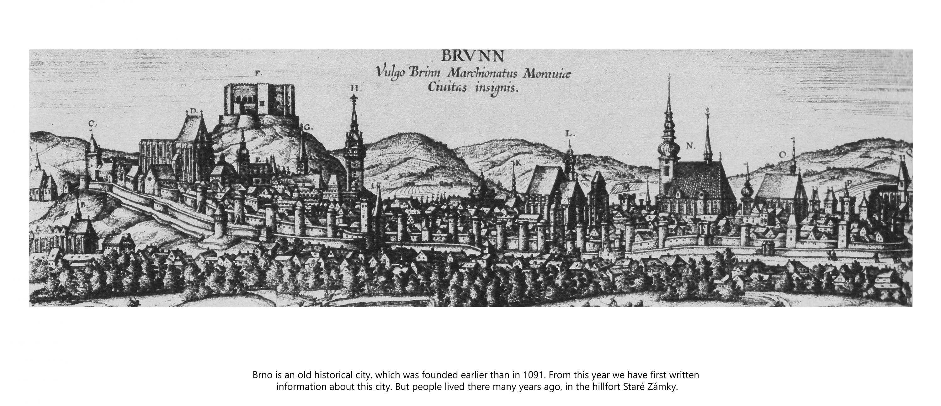
The shape of the building was influenced by the view of the castle Špilberk. That´s very important for us. Connecting the gallery with an iconic building in the city. We realized that the building will be seen from the castle and this new shape doesn´t disturb the view.
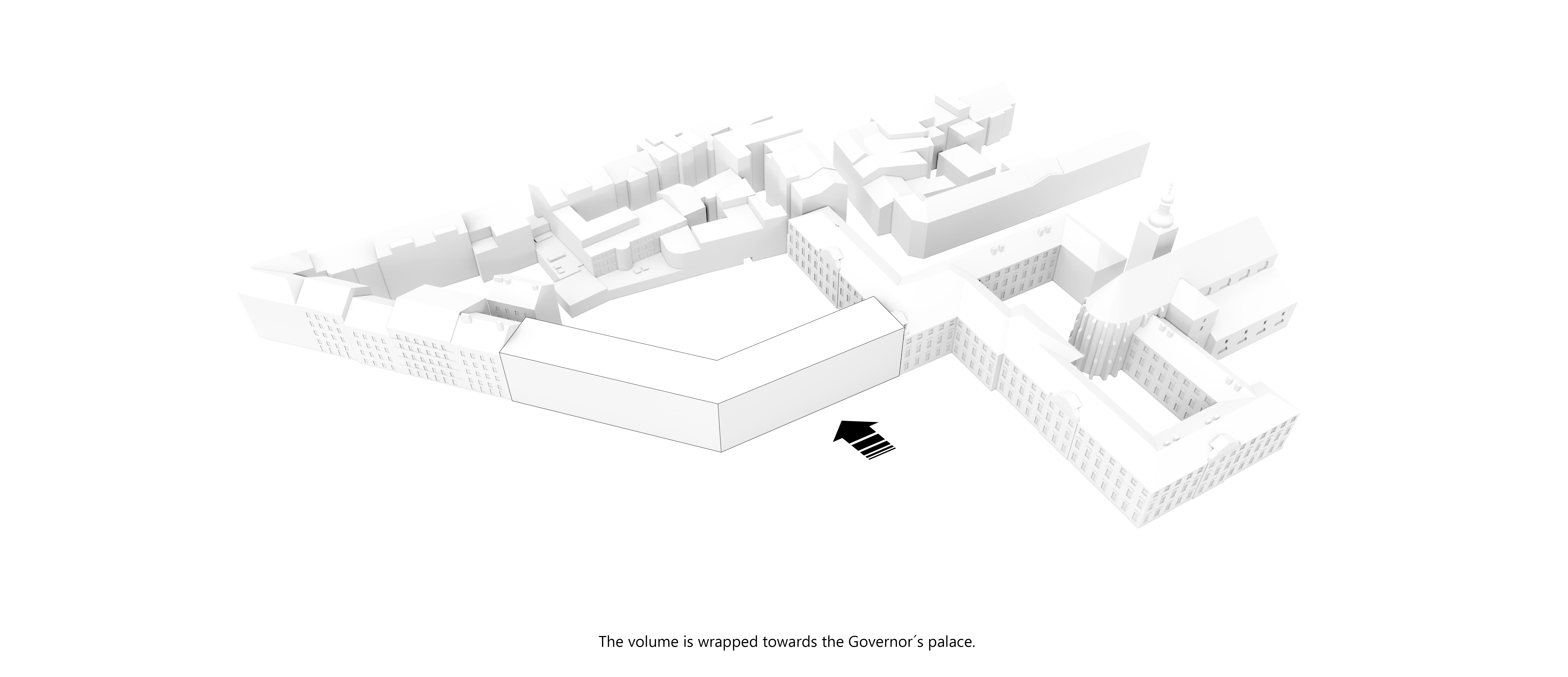
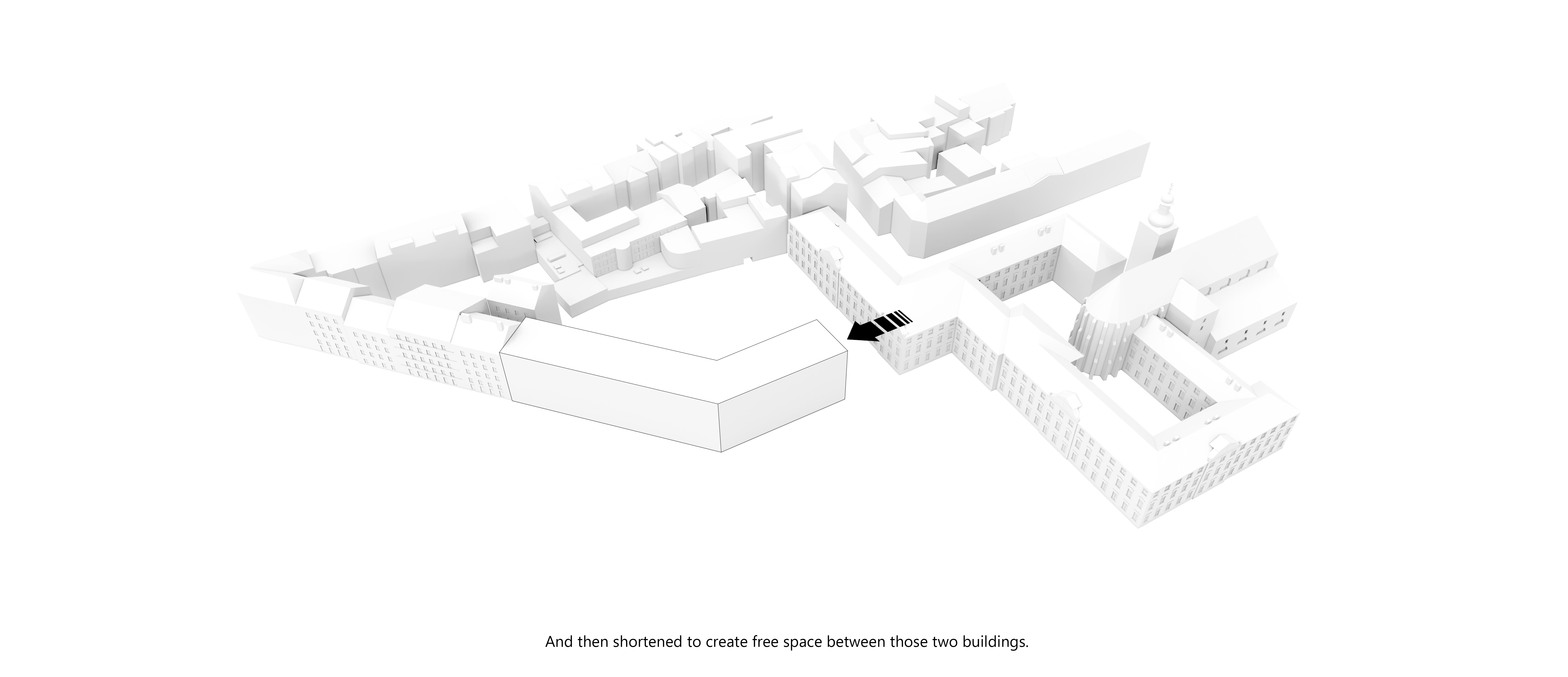
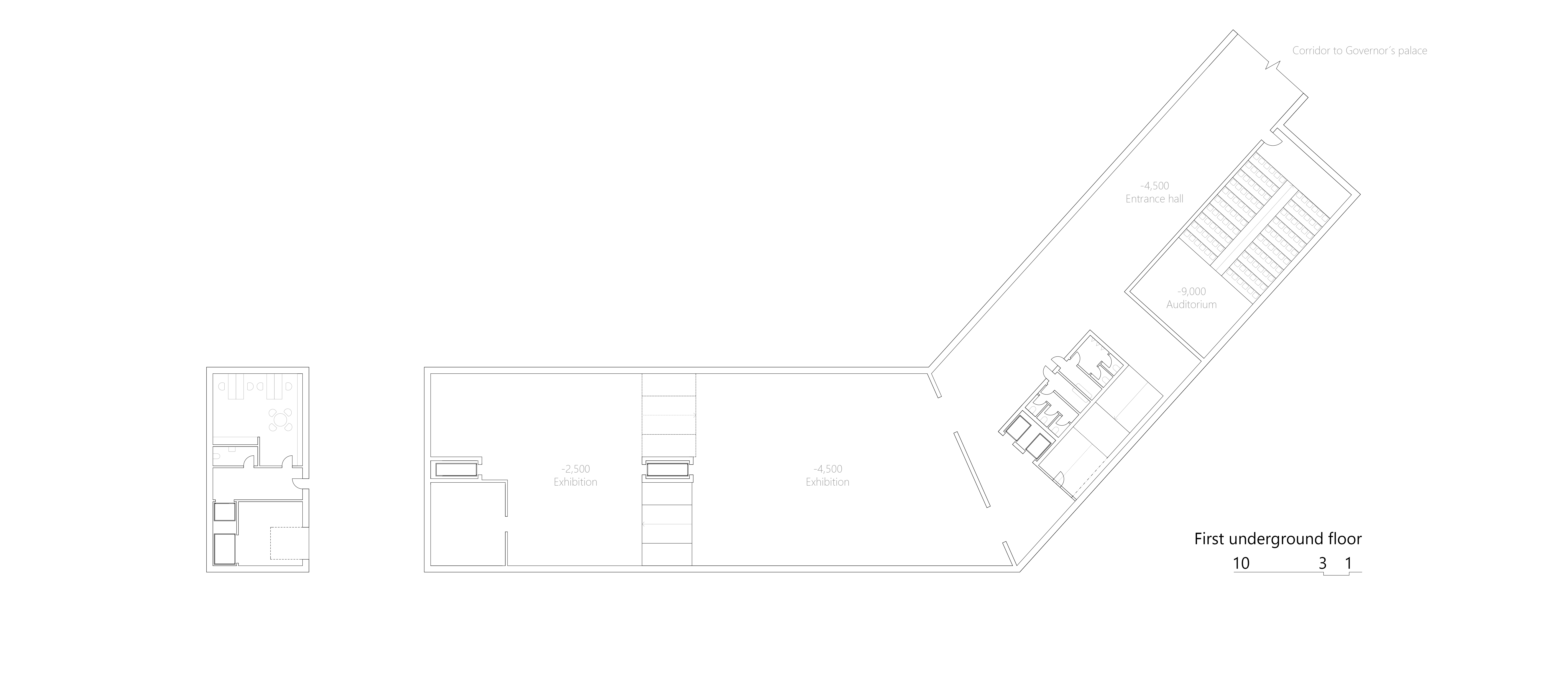
We realized the strong place of the Governor´s palace. The connection to this building is underground. We didn´t want to disturb the individuality of both buildings. With their nearness, they created tension and imaginary entrance to the urban block. And the position of the palace wasn´t weakened.
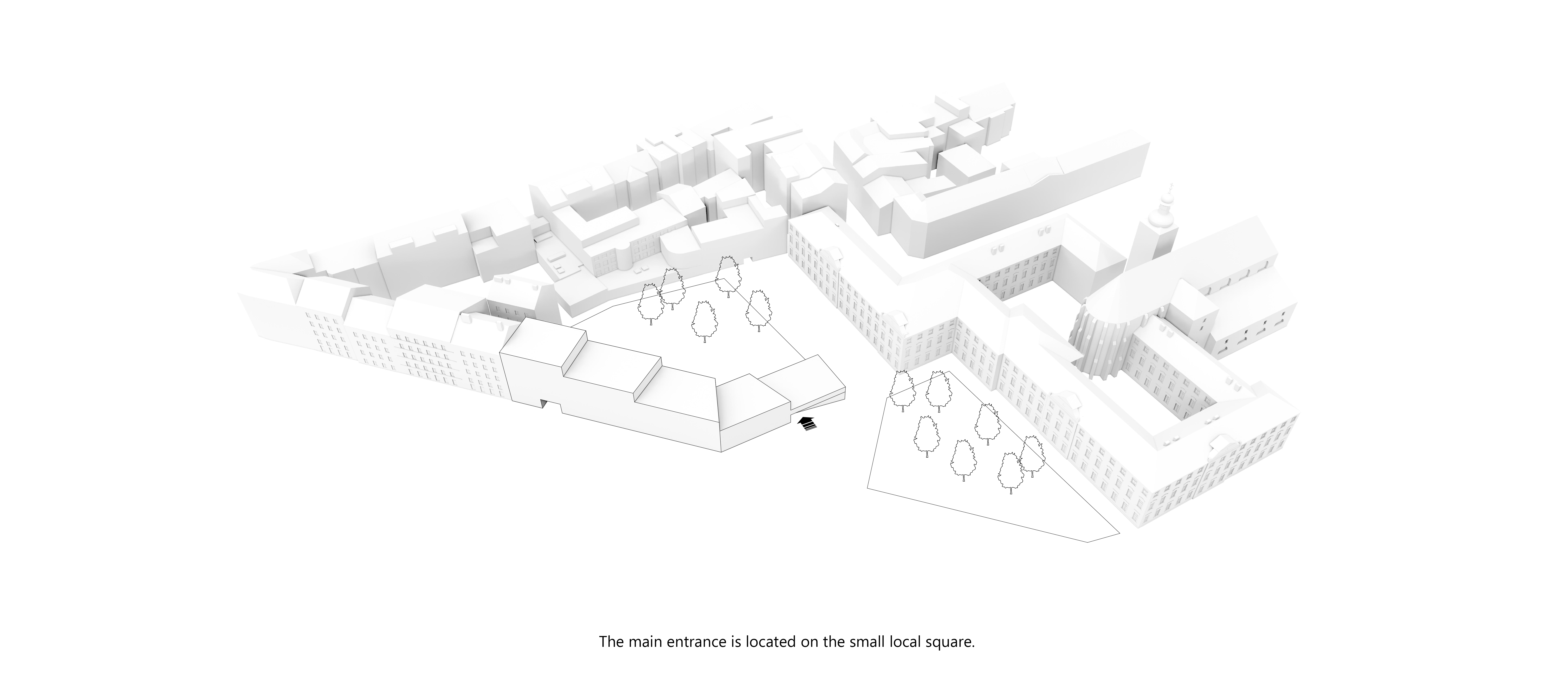
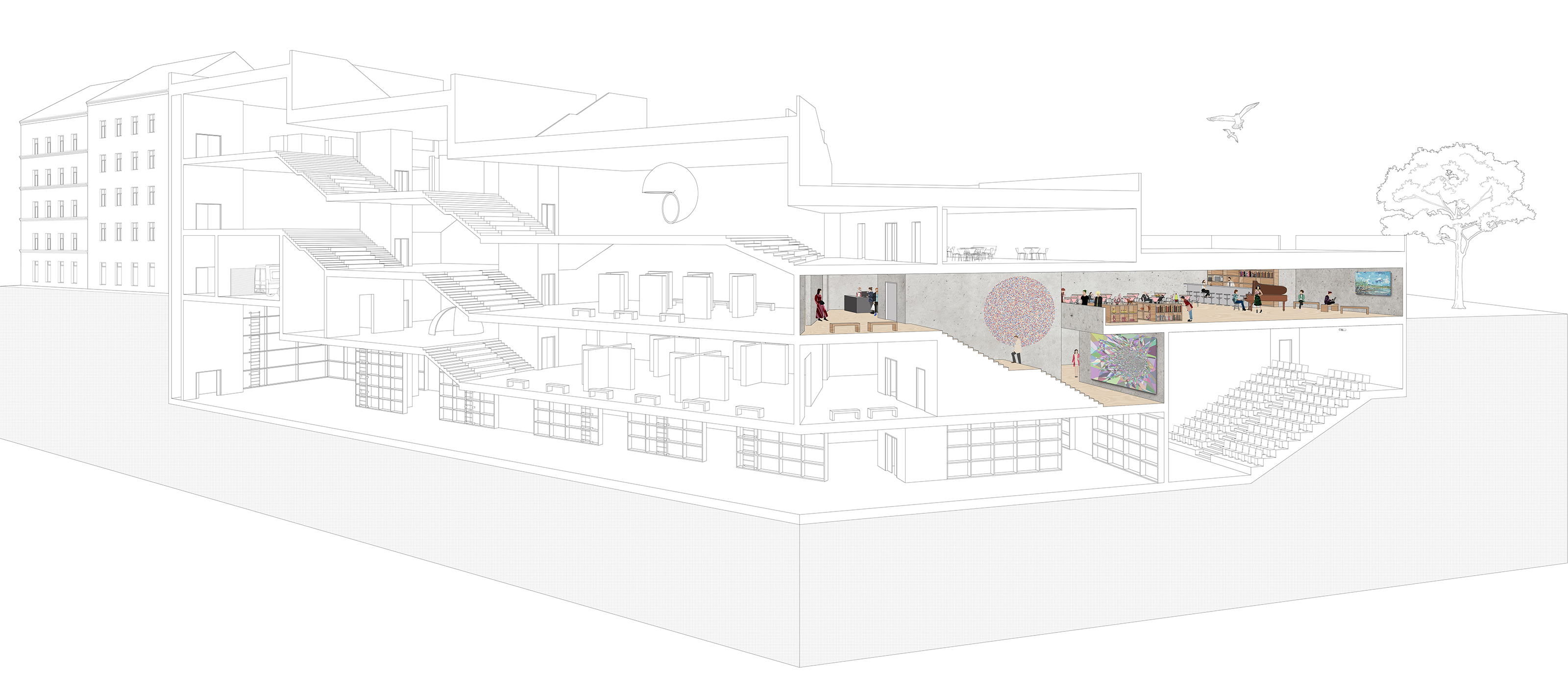
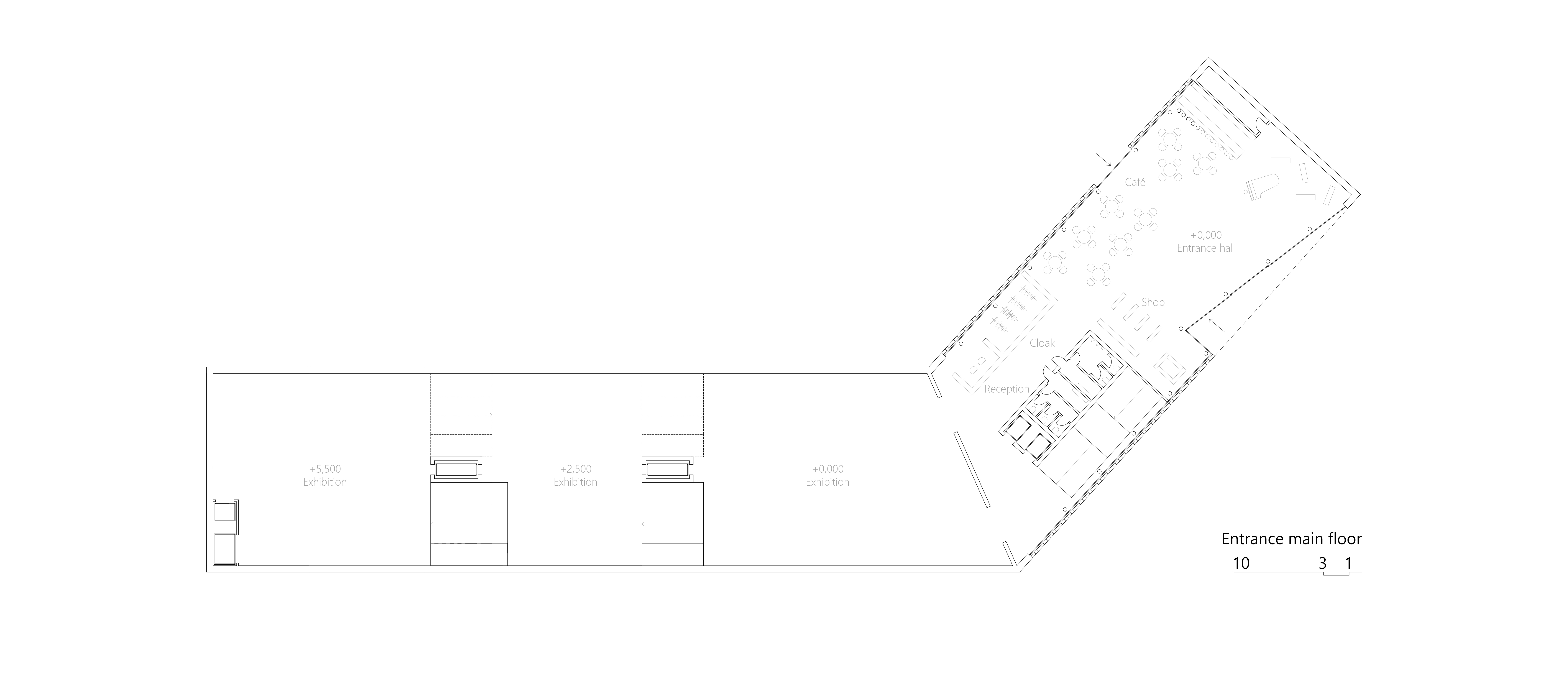
The entrance hall of the building is available for everyone. The paid part of the gallery is behind reception.
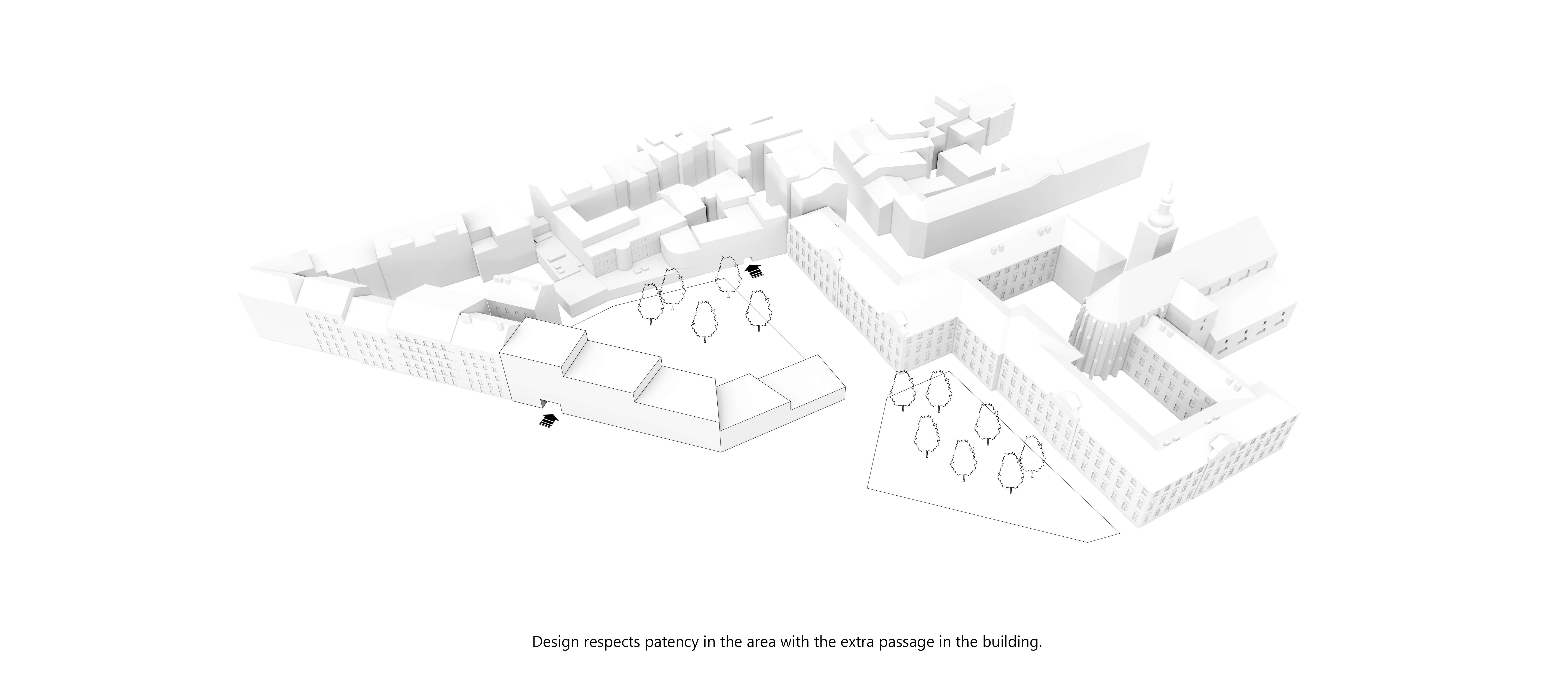
On the left side of the building is a passage, which leads to the garden and the passage Typos and passage inside of the Governor´s palace.
We respected the present throughput in the area.
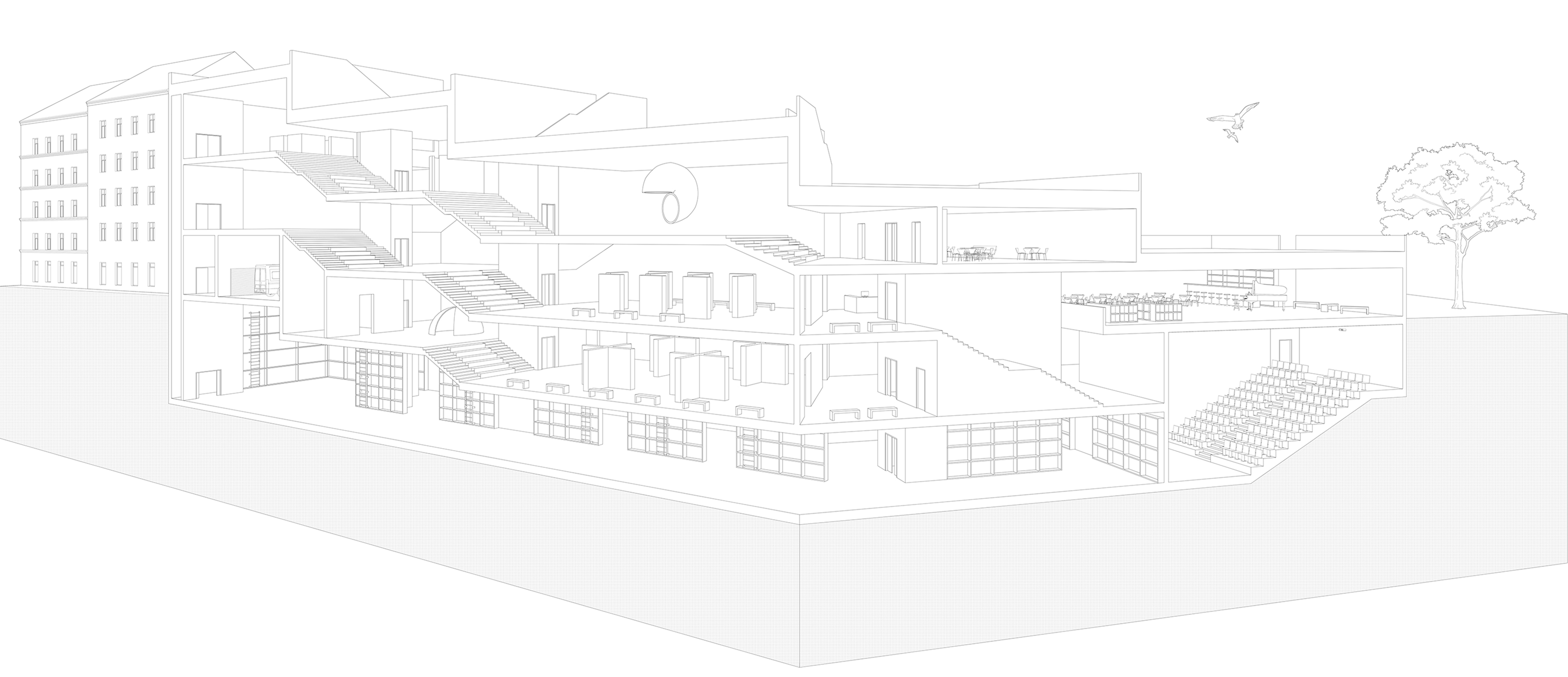
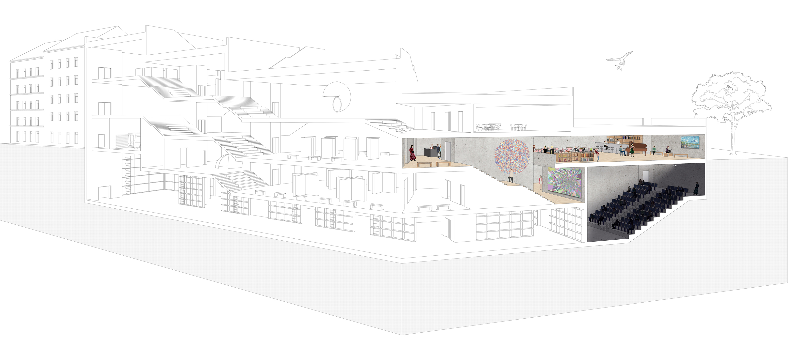
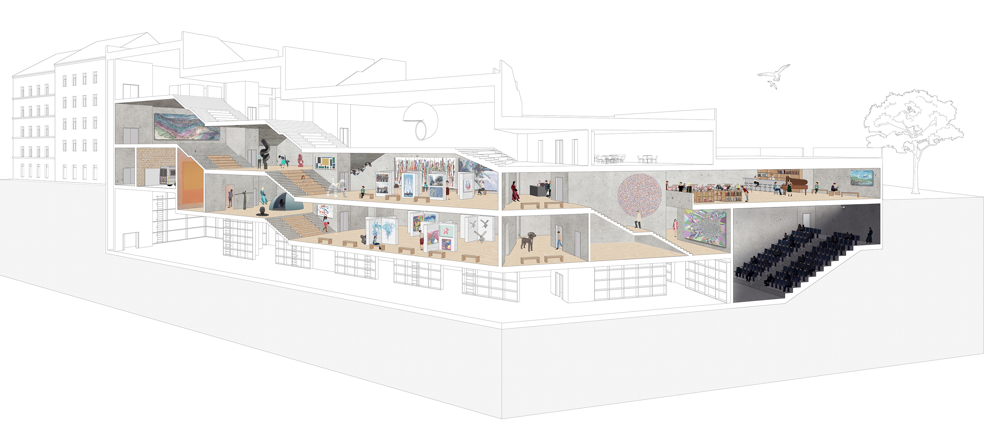
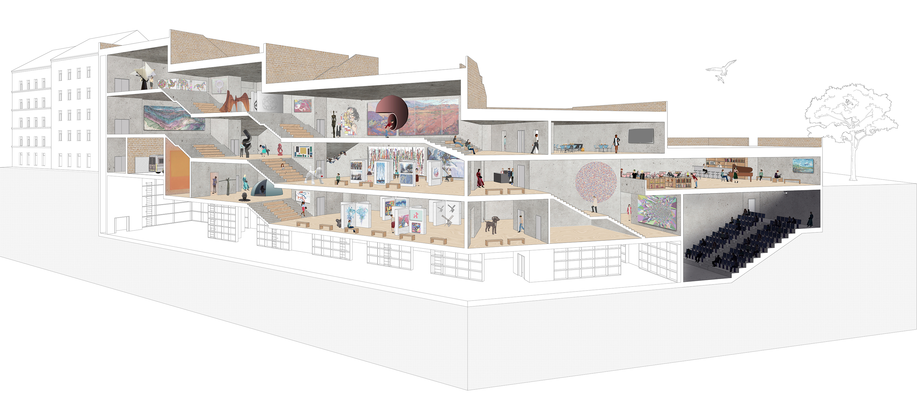
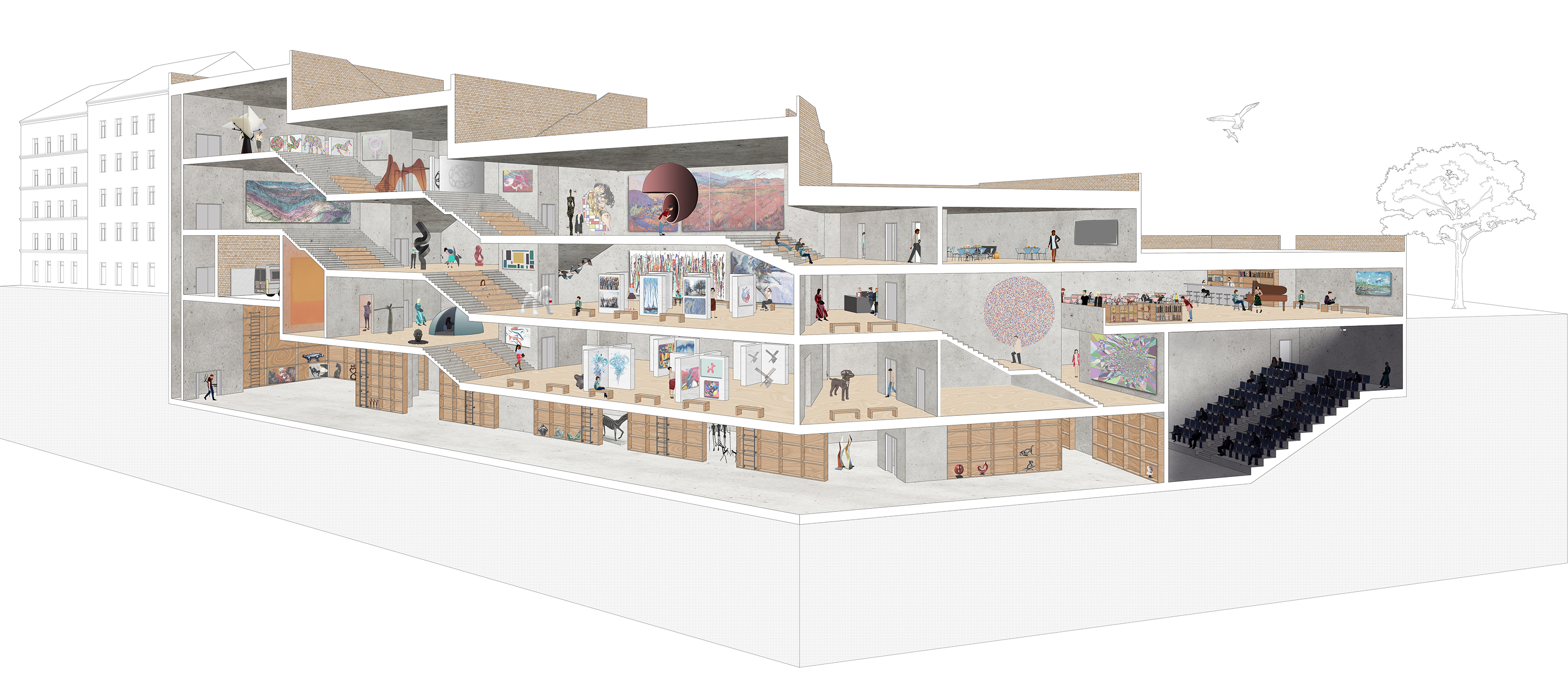
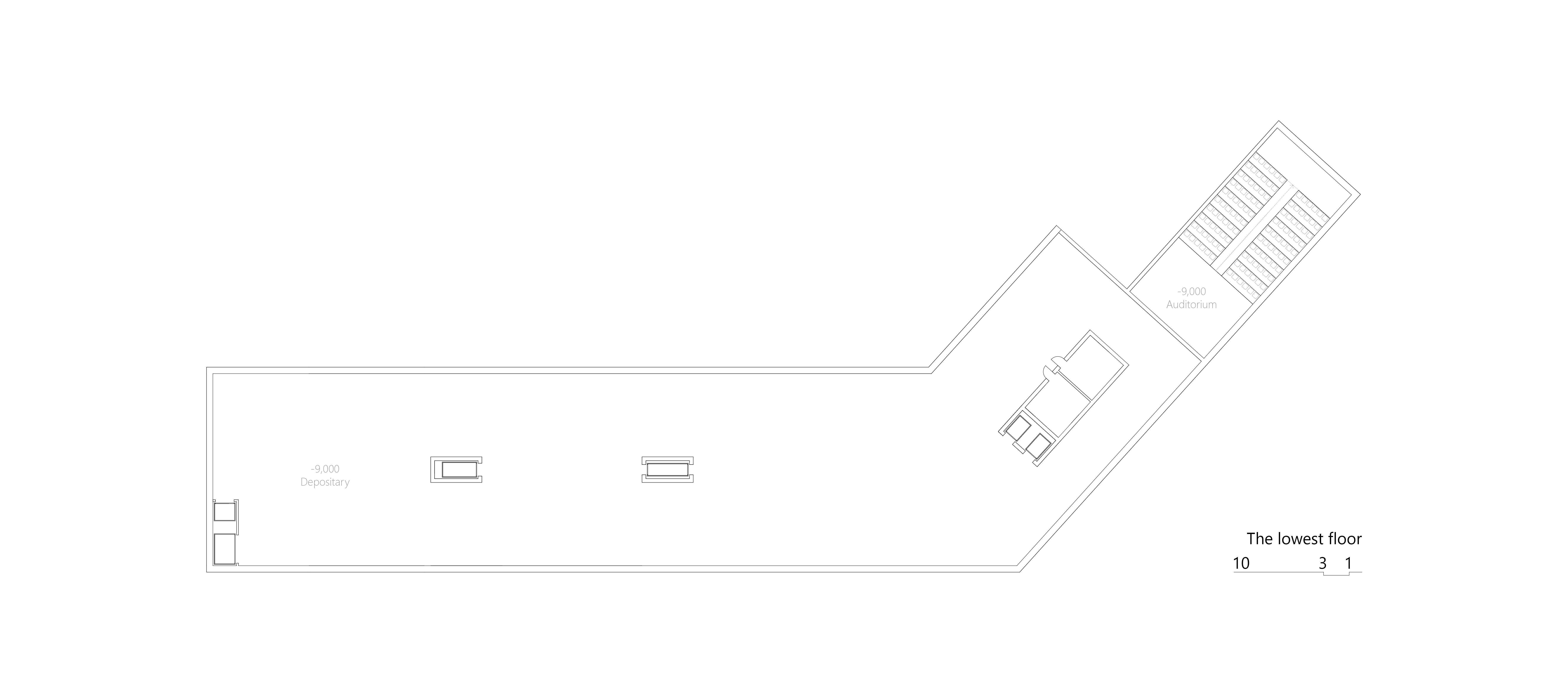
Also in this passage is the entrance to the depositary and administration. The form of the inner space is very simple. We created fluent space, as you can see from the perspective. Every part is connected to another one. All the parts are barrier-free.
The most important theme in the gallery is sitting. walking throw the gallery can be very tiring. We created a lot of places to relax in. Sitting stairs are everywhere. We are mixing exhibition and relaxing spaces. We wanted to create a pleasant space for people, for their talking not only for the exhibition.
Project name
Location
Year
Project type
Design team


